Introduction: A Logo Is Not Art — It Is the Fastest Way to Communicate Who You Are
Most businesses think a logo is:
- a symbol
- a shape
- a graphic
- a design aesthetic
- a creative idea
But for founders, directors, and CXOs aiming to scale — a logo is a business tool.
A strong logo and visual identity system:
- shapes perception in seconds
- signals trust
- creates instant recall
- anchors brand positioning
- differentiates you from competitors
- influences pricing power
- drives brand recognition
- aligns customer expectations
- strengthens market presence
And in a crowded, distracted digital world, your logo is often the first moment of truth.
Debox builds identity systems that are strategic, psychological, timeless, and scalable — designed for real-world business impact.
Why Most Logos & Brand Identities Fail (Even If They Look Good)
Most logos don't fail because of poor aesthetics. They fail because design was prioritized over strategy.
Across industries — restaurants in the USA, manufacturing firms in India, service brands in Dubai — we've observed the same root problems.
1. Identity Is Designed Without Clear Brand Positioning
Businesses say:
- "Make it modern."
- "Make it luxurious."
- "Make it bold."
- "Make it minimal."
But they don't define:
- what the brand stands for
- what differentiates it
- what promise it carries
- what emotions it should evoke
- how it should position against competitors
- how it should support pricing, product strategy, and future expansion
Without positioning, identity becomes subjective.
Design becomes decoration — not differentiation.
2. Visual Identity Is Based on Preference, Not Psychology
Many logos reflect personal tastes:
- "I like blue."
- "Use serif fonts."
- "I want a circular icon."
But customers don't buy based on founder preferences. They buy based on meaning.
Identity must be rooted in:
- colour psychology
- shape psychology
- cognitive recognition
- category memory
- trust-building cues
- emotional relevance
Design must speak to the customer's mind — not the founder's.
3. Logos Are Overcomplicated or Trend-Driven
Common mistakes:
- too many lines
- complex geometry
- hyper-creative designs
- trendy fonts
- detailed motifs
- ideas that don't scale
Great identities must be:
- simple
- scalable
- timeless
- meaningful
- memorable
Not complex.
4. The Identity Doesn't Scale Across Touchpoints
A logo must work across:
- website
- packaging
- signage
- merchandise
- mobile icons
- email signatures
- digital ads
- app UI
- restaurant interiors
- product labels
- investor decks
If the identity breaks across formats, the brand looks inconsistent and unprofessional.
5. No Unified Visual Identity System
Most agencies hand over just:
- a logo
- a colour palette
- a font family
But a real identity system includes:
- grids
- spacing rules
- do's and don'ts
- secondary colours
- type hierarchy
- iconography
- layout principles
- photographic style
- motion identity
Without a full system, teams don't know how to maintain consistency.
The Debox Way: Identity Systems Built on Strategy, Psychology & Real-World Application
Debox approaches identity like a consulting project, not a design project.
Our methodology blends:
- business thinking
- brand strategy
- customer psychology
- visual engineering
- communication clarity
- future scalability
Here's how we build identity systems that last 10–15 years, not 10–15 months.
1. Brand Strategy Comes First
Before touching design, we define:
Brand DNA
What the brand stands for.
Brand Promise
What customers should expect.
Brand Personality
How the brand behaves emotionally.
Brand Differentiation
How you stand out in the category.
Customer Segments
Who you are speaking to.
Business Direction
How the brand is expected to scale.
Identity becomes strategic — not subjective.
2. Build Meaning Through Psychology
We use principles of:
Colour Psychology
- blue → trust
- red → energy
- green → wellness/sustainability
- black → luxury
- yellow → optimism
- purple → creativity
Shape Psychology
- circles → community, approachability
- squares → stability, balance
- triangles → direction, progress
- abstract shapes → innovation
Typography Psychology
- serif → heritage, authority
- sans-serif → modern, clean
- display fonts → personality
- monospace fonts → technical precision
Identity is designed to feel right instantly.
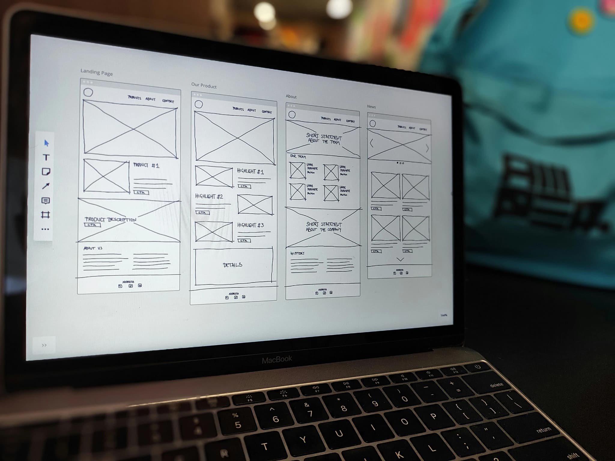
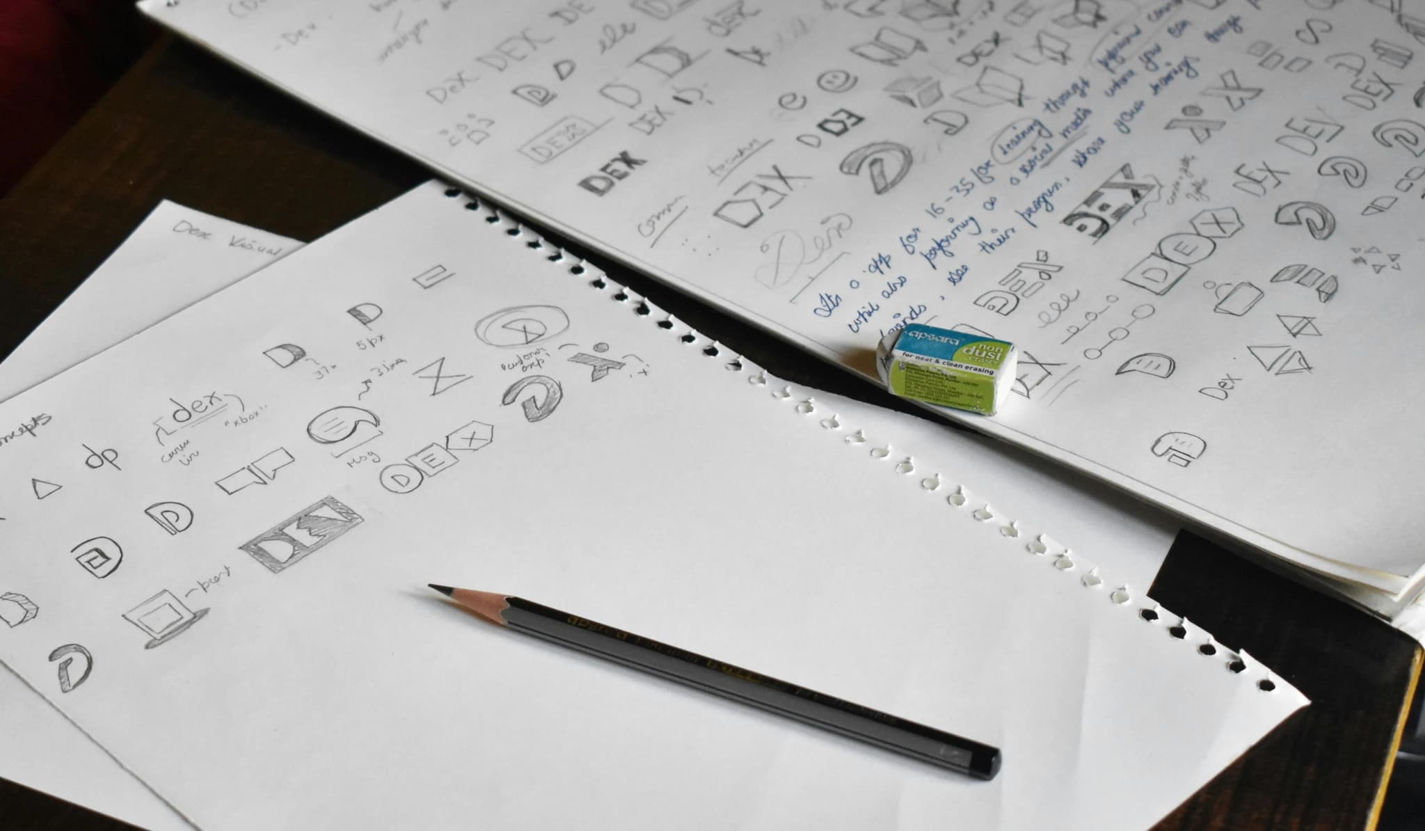
3. Design a Logo That Works Everywhere
We ensure the logo is:
- simple
- scalable
- meaningful
- timeless
- versatile
- recognisable
- distinct
We test the logo across:
- black & white
- outdoor signage
- app icons
- website header
- printing limitations
- embroidery
- packaging
- tiny sizes (16–18px)
- large hoardings
If it doesn't work across formats, it doesn't work.
4. Build a Complete Visual Identity System (VIS)
A strong VIS includes:
- primary logo
- secondary logo (responsive variants)
- logomark (symbol)
- colour palettes (primary + secondary)
- grid & spacing system
- typography hierarchy
- iconography style
- layout principles
- brand patterns
- photo & illustration style
- tone & emotion guides
- brand application mockups
This creates consistency across the organization.
5. Real-World Implementation
Debox actively supports the application of the identity across:
Digital
- Website
- Social media
- Ads
- Emailers
- Landing pages
Physical
- Packaging
- Signage
- Interiors
- Stationery
- Uniforms
Business
- Pitch decks
- Documents
- Proposals
- Presentations
Identity becomes a business system, not a file.
Case Study 1: Premium Restaurant Chain – USA
Challenge:
- inconsistent logos
- inconsistent colours
- weak premium cues
- fragmented brand identity
Debox rebuilt:
- brand positioning
- logo
- visual system
- packaging identity
- digital visuals
Outcome:
- improved brand perception
- increased online orders
- stronger recall
- higher perceived value
Identity impacted both brand and revenue.
Case Study 2: B2B Manufacturing Brand – India
Challenge:
- dated identity
- unclear category positioning
- weak global representation
- low trust cues
Debox delivered:
- new identity system
- modern visual language
- global-standard deck templates
- website redesign
Outcome:
- better acceptance by global buyers
- improved brand trust
- higher inquiry quality
Identity became a catalyst for expansion.
Conclusion: A Logo Isn't Just a Mark — It's Your Brand's First Promise
A powerful visual identity:
- builds trust before a word is spoken
- influences perception in milliseconds
- differentiates you instantly
- supports premium pricing
- strengthens recognition
- scales with business growth
- creates emotional memory
- communicates professionalism
- positions your brand for the future
Debox doesn't design logos. We design identity systems that become the foundation of growth, differentiation, and long-term brand leadership.
A logo is not creativity. A logo is strategy expressed visually.