Introduction: Your Collateral Speaks Before You Do
Every business invests in:
- digital presence
- website
- ads
- social media
- brand identity
But often forgets one of the most influential touchpoints:
Printed and physical brand collateral.
Even in a digital world, physical brand touchpoints create some of the strongest emotional impressions because they are:
- tangible
- memorable
- personal
- sensory
- impactful
- permanent
Whether it's:
- brochures
- menus
- visiting cards
- billboards
- flyers
- in-store branding
- packaging inserts
- event materials
- branded stationery
- POS materials
…these small details shape how customers perceive your brand's credibility, scale, and seriousness.
Most companies dismiss printing as an "execution task." But for founders, directors, and CXOs looking to build strong brands, collateral is strategy.
At Debox, we design and manage printed collateral as a professional trust-building system, not as files to be printed.
Why Most Printed Collateral Fails (Even When the Branding Is Good)
Across categories — restaurants in the USA, manufacturing firms in India, service companies in Dubai — poor collateral weakens the brand more than leaders realize.
Here's why collateral fails:
1. Designed Without Brand Strategy
Most collateral pieces are executed like:
- templates
- last-minute tasks
- direct print from Canva
- random visuals
- inconsistent layouts
But strong collateral must reflect:
- brand positioning
- visual identity system
- core messaging
- emotional tone
- customer psychology
- consistency across touchpoints
When collateral is inconsistent, customers feel the brand is inconsistent.
2. Poor Print Quality Damages Perception
Cheap printing leads to:
- faded colours
- flimsy paper
- low-quality finish
- poor binding
- blurry images
- mismatched tones
Customers unconsciously associate print quality with:
- product quality
- service quality
- brand credibility
- leadership professionalism
Your brochure quality directly influences your perceived value.
3. No Information Hierarchy or Purpose
Many brochures, menus, and flyers overload customers with:
- too much text
- irrelevant details
- dense layouts
- confusing flow
Collateral must be designed with conversion logic, not content collection.
Each asset must answer:
- What does the customer need to know first?
- What builds trust?
- What drives action?
- What reduces doubts?
Otherwise, collateral becomes clutter — not communication.
4. Inconsistent Visual Language Across Pieces
Common problems:
- different fonts on different materials
- outdated logos on old collateral
- mismatched color tones across vendors
- varying layouts between outlets
- inconsistent brand voice across brochures and menus
Inconsistency signals immaturity. Debox ensures every piece follows a strict identity system.
5. Collateral Is Not Built for Real-World Usage
Real-world problems include:
- menus that tear
- brochures that smudge
- signage that fades
- POS displays that topple
- flyers that feel "cheap"
- visiting cards that bend easily
Collateral must be engineered for:
- durability
- handling
- lighting
- weather
- repeat use
- texture
- longevity
Design alone is not enough — engineering matters.
The Debox Way: Collateral Systems That Strengthen Trust, Experience & Conversion
Debox builds printing and collateral systems using:
- brand strategy
- psychology
- visual identity
- material science
- operational logic
- experience design
- manufacturing knowledge
We create collateral that looks premium, feels premium, and performs in real-world conditions.
1. Align Collateral With Brand Strategy
We begin by mapping:
- brand positioning
- ideal customer
- price point
- value perception
- business category
- experience promise
- touchpoint journey
Collateral must express the brand at every customer interaction.
2. Design With Purpose, Not Aesthetics
Debox designs every collateral item with clarity on:
What outcome does this asset need to achieve?
Examples:
Restaurant Menu
- drive ordering
- showcase signature items
- highlight high-margin dishes
- reduce ordering confusion
Corporate Brochure
- build trust
- simplify offerings
- support sales team
- reduce explanation time
Product Leaflet
- communicate value crisply
- highlight differentiators
- support retail visibility
Event Display
- attract attention
- deliver messaging fast
- reinforce brand identity
Collateral becomes functional, not decorative.
3. Build a Unified Collateral System
Debox creates a structured system:
- typography hierarchy
- spacing guidelines
- visual pattern logic
- brand layout grids
- brand colour standards
- photographic/illustration style
- iconography
- headline/secondary copy structure
Every piece is consistent — creating instant recall.
4. Material & Print Engineering
Debox selects materials based on:
Aesthetic Needs
Matte, gloss, textured, premium feel.
Durability Needs
Heat resistance, water resistance, tear resistance.
Category Needs
- restaurants → stain-resistant menus
- retail → high vibrance prints
- luxury brands → textured premium stock
- outdoor → UV resistant signage
Cost Efficiency
Right quality at the right budget.
Debox ensures every asset feels premium in hand.
5. Message Architecture & Microcopy
We craft messaging that clarifies:
- what you do
- why it matters
- why trust you
- what differentiates you
- what action to take
Microcopy ensures:
- clarity in instructions
- reduced confusion
- smoother user flow
- better conversions
Collateral must speak clearly — not loudly.
6. Real-World Prototyping & Testing
Before mass production, Debox tests:
- colour accuracy
- print thickness
- glare/reflections under lights
- readability from a distance
- durability under handling
- smudge resistance
- logo visibility
- material performance
This ensures you print once — and print right.
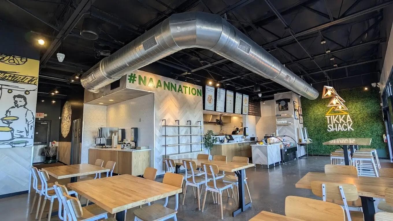
Case Study 1: Restaurant Chain – USA
Problems:
- multiple outlets using inconsistent menus
- low-quality takeaway menus
- poor in-store branding
- unclear item grouping
Debox redesigned:
- dine-in menus
- takeaway menus
- in-store flyers
- promotional materials
- POS display stands
Outcome:
- menu-driven ordering improved 29%
- brand became visually unified
- customers perceived outlets as more premium
- upsell items increased 22%
Collateral directly influenced revenue.
Case Study 2: Manufacturing Export Firm – India
Challenge:
- brochures looked outdated
- poor trust cues
- inconsistent designs across teams
- weak global perception
Debox created:
- world-class corporate brochures
- product sheets
- trade show displays
- executive business cards
- packaging inserts
Outcome:
- increased inquiry quality
- improved client trust
- stronger global buyer meetings
- brand perception significantly elevated
Collateral built international credibility.
Conclusion: Collateral Is Not Printwork — It Is Perception Engineering
High-quality collateral:
- builds trust
- elevates brand perception
- creates consistency
- supports sales
- improves customer experience
- conveys professionalism
- increases conversion
- reduces friction
- strengthens recall
- compounds brand equity
Your collateral is often the first physical interaction customers have with your brand. It cannot be mediocre.
At Debox, we design and engineer collateral that transforms brand perception and enhances business performance.
Because every touchpoint matters. And your brand deserves excellence — everywhere.


