
Introduction: Your Website Is Not a Brochure — It Is Your Strongest Sales Engine
For most businesses, a website is treated as a design project.
- "We need a new look."
- "Make it modern."
- "Add animations."
- "Make it aesthetic."
And while design matters, design alone does not convert.
A website's real job is to:
- communicate value
- build trust
- guide decisions
- reduce friction
- answer objections
- create desire
- enable conversion
- qualify leads
- drive inquiries, orders, appointments, and revenue
Your website is the first salesperson most customers meet. And in many cases, the only salesperson they trust.
At Debox, we believe websites don't fail because they look bad. They fail because they are built backward — from design to content to conversion.
A high-conversion website is built forward — from customer psychology → to value → to messaging → to UX → to design → to performance.
This is where most websites break.
Why Most Websites Don't Convert
Across hundreds of businesses we've worked with — from USA-based restaurants to Indian corporates and global B2B manufacturers — the same issues repeat.
Let's break down the real reasons websites underperform.
1. Websites Are Built for Aesthetics, Not Decision-Making
Most agencies design for:
- aesthetics
- UI trends
- surface-level impressions
- "looking premium"
But customers make decisions based on:
- clarity
- trust
- relevance
- ease
- proof
- value
Websites with beautiful UI and weak UX fail because they look great but say nothing.
Design draws attention. Messaging drives conversion.
2. The Website Is Built for the Founder — Not the Customer
A recurring problem:
- The founder selects colours
- The founder edits copy
- The founder chooses layout
- The founder asks for more visuals
- The founder adds 20 offerings on the homepage
The customer's psychology disappears.
Websites should be built for the customer's brain, not the founder's preference.
3. No Clarity in the First 3 Seconds
If users cannot answer in three seconds:
- What do you do?
- Why should I care?
- Is this for me?
…they leave.
Most websites have confusing hero sections like:
- "Innovating the future."
- "Empowering excellence."
- "Solutions for tomorrow."
Customers do not understand vague promises. They respond to clarity.
4. No Trust Architecture
In a world where everyone promises excellence, customers look for:
- case studies
- measurable results
- client logos
- testimonials
- before/after data
- proof of expertise
Websites without trust fail — even if the company is excellent.
5. Lack of Conversion Logic
Most websites fail at simple conversion logic:
- unclear CTAs
- multiple CTAs fighting each other
- no single conversion goal
- poor information hierarchy
- no social proof near CTAs
- no friction-reducing microcopy
- confusing navigation
Conversion is not creativity. Conversion is architecture.
6. Poor Technical Performance
Design and messaging aside, many websites break because:
- they load slowly
- they are not mobile-optimized
- they have poor SEO structure
- they use heavy themes
- they are built on outdated CMS
- they contain broken scripts
Every 1-second delay in load speed reduces conversions by 7–10%.
But businesses often don't even know this leak exists.
The Debox Way: Websites Engineered for Conversion, Not Decoration
Debox approaches websites like a business system, not a design project.
We follow a consulting-grade methodology that integrates:
- psychology
- communication
- UI engineering
- UX flow
- SEO logic
- business outcomes
- performance optimization
- structured storytelling
Our websites convert because they are built with intention, logic, and depth.
1. Clarity-First Messaging Framework
We create messaging that answers:
- What do you solve?
- Who do you solve it for?
- Why is your solution better?
- What outcomes can customers expect?
- How can they trust you?
- What should they do next?
This clarity is the foundation of conversion.
2. Customer Psychology Mapping
We study:
- buying triggers
- pain points
- emotional drivers
- objections
- search intent
- category expectations
- decision-making behavior
- trust signals
- content reading patterns
The website speaks the customer's language — not the company's.
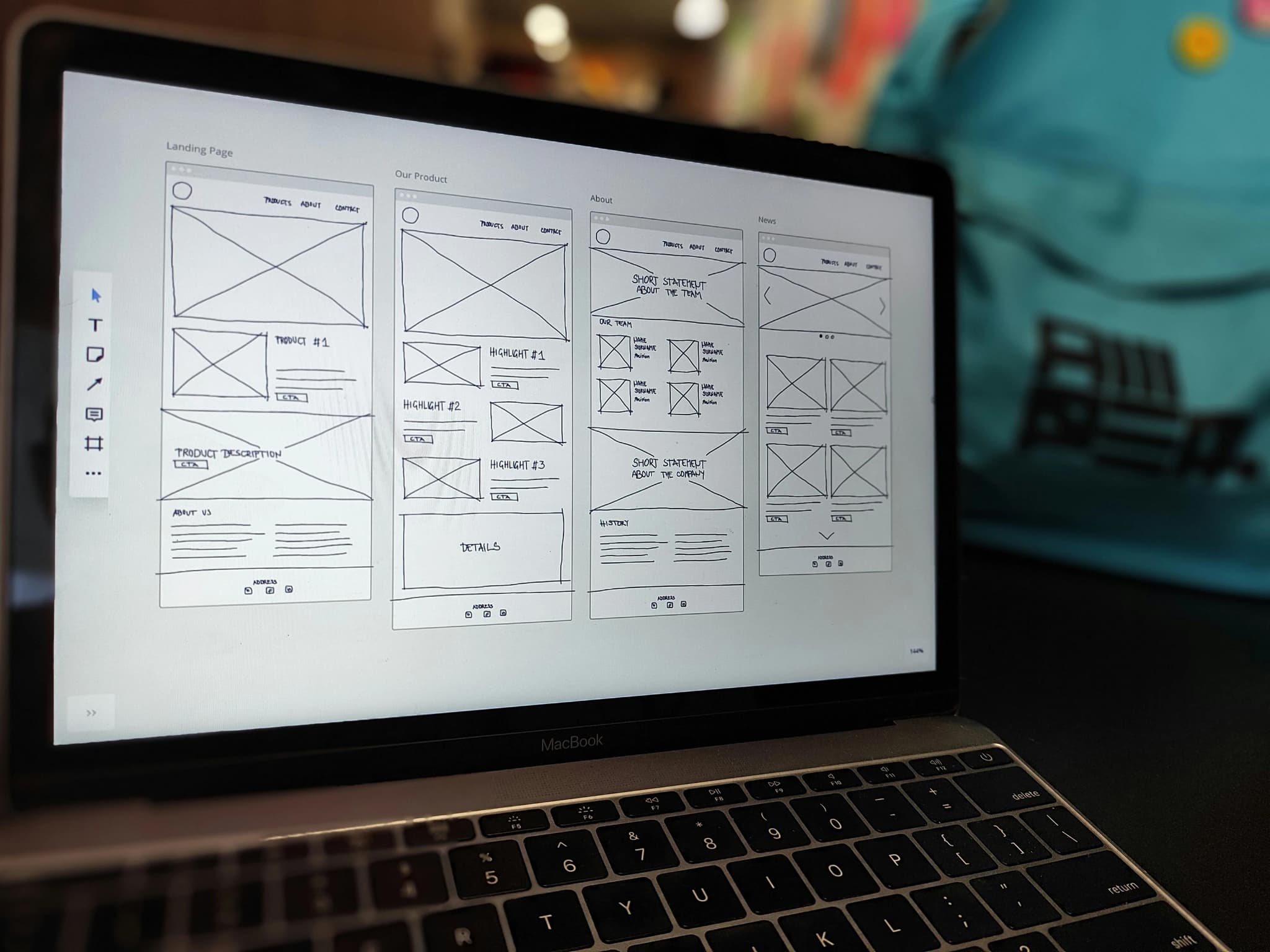
3. Build a High-Conversion UX Flow
Before UI design, we design:
- scroll journey
- section hierarchy
- information rhythm
- visual anchors
- conversion zones
- social proof placement
- CTA architecture
- behavioural nudges
The entire website is engineered to move the user closer to conversion, step by step.
4. Visual Identity That Supports Conversion
Our UI design is clean, minimal, premium, and intentional — inspired by Apple, IDEO, and global consulting firms.
UI is designed to:
- reduce cognitive load
- increase reading ease
- strengthen the brand
- guide attention
- build trust
- create emotional connection
UI should support UX — never overshadow it.
5. SEO-Driven Content Architecture
We structure content for:
- high-intent keywords
- semantic relevance
- topic clusters
- internal linking
- on-page optimization
- metadata and schema
- alt and accessibility structure
This ensures the website ranks well for the keywords your customer searches.
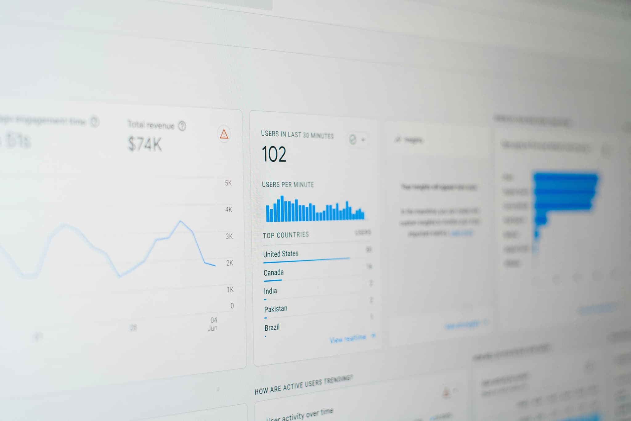
6. Speed, Performance & Technical Excellence
We optimize:
- loading time
- caching
- code minification
- image compression
- script optimization
- CMS structure
- Google Core Web Vitals
This ensures the website performs at enterprise-grade speed.
Fast websites convert. Slow websites leak revenue.
7. Conversion Optimization Deep Integration
We use:
- trust blocks
- testimonial clusters
- stat-based proof
- industry-specific case studies
- interactive components
- decision guides
- microcopy around CTAs
- exit-intent logic
- smart form structures
This turns the website into a powerful conversion engine.
Case Study 1: Indian Luxury Brand Realigning for Scale
Challenge:
- Low conversion
- Poor brand clarity
- Outdated website
- No SEO structure
Debox rebuilt the entire digital ecosystem.
Outcome:
- Time on page increased 63%
- Conversion rate increased 42%
- Bounce rate reduced 35%
- Brand perception improved significantly
Because clarity + credibility = conversion.
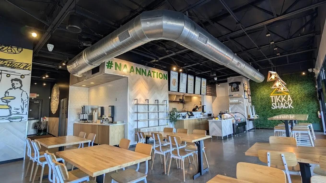
Case Study 2: USA Restaurant Chain Website
Challenge:
- High traffic
- Low online order conversion
- Confusing UX
- Weak mobile experience
Debox redesigned:
- Homepage
- Menu flow
- Ordering logic
- Location-based funnels
- Offers & CTAs
Outcome:
- Online orders increased 38%
- Checkout abandonment dropped 22%
- Mobile conversion increased 51%
Because good UX directly translates to revenue in the F&B category.
Conclusion: Websites Don't Need to Be Loud — They Need to Be Clear
A high-performing website does the following exceptionally well:
- communicates value
- builds trust
- removes friction
- guides decisions
- reduces cognitive load
- answers objections
- showcases credibility
- drives conversion
- supports long-term SEO
- scales with the business
This is why Debox-built websites convert higher, load faster, and communicate better — because they are engineered, not designed.
A great website is not an expense. It is a revenue engine that compounds.